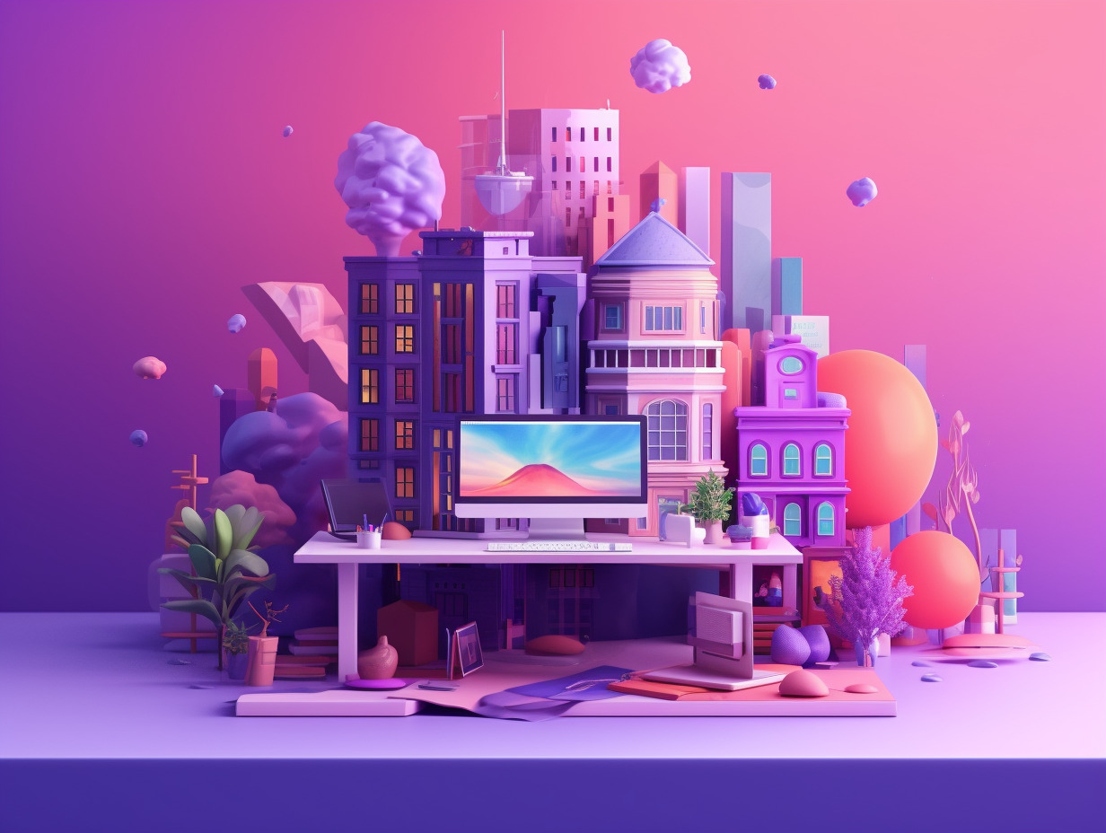
In the ever-evolving world of web design, staying up-to-date with the latest trends is crucial to staying relevant and delivering exceptional user experiences. As technology advances and user preferences shift, web design trends follow suit. Let’s explore the importance of keeping up with web design trends and how they evolve over time.
Web design is not a static field; it’s a dynamic and ever-changing landscape. User expectations and preferences continually evolve, influenced by emerging technologies, design aesthetics, and user experiences across the web. By staying abreast of the latest trends, you can ensure that your websites are visually appealing, functional, and engaging for users.
Web design trends are not set in stone. They evolve as designers experiment with new ideas, technologies emerge, and user behaviors change. What was considered modern and cutting-edge a few years ago may now seem outdated. By understanding how web design trends evolve, you can anticipate shifts in user expectations and adapt your designs accordingly.
As we delve into the realm of web design trends in 2023, keep in mind the importance of embracing innovation and staying ahead of the curve. Let’s explore the exciting trends that are shaping the future of web design.
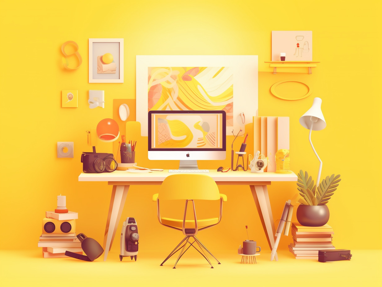
Dark Mode and Color Schemes
In recent years, dark mode has emerged as a popular trend in web design. Dark mode offers a sleek and sophisticated aesthetic, providing a refreshing alternative to the traditional light background. With its subdued color palette and reduced screen brightness, dark mode creates a visually pleasing and comfortable browsing experience for users, especially in low-light environments.
Implementing dark mode in web design not only enhances the visual appeal but also offers practical benefits. It helps reduce eye strain, improve battery life on certain devices, and allows content and design elements to stand out more prominently. As a web designer, embracing dark mode can add a modern touch to your designs and cater to the preferences of users seeking a more immersive and stylish experience.
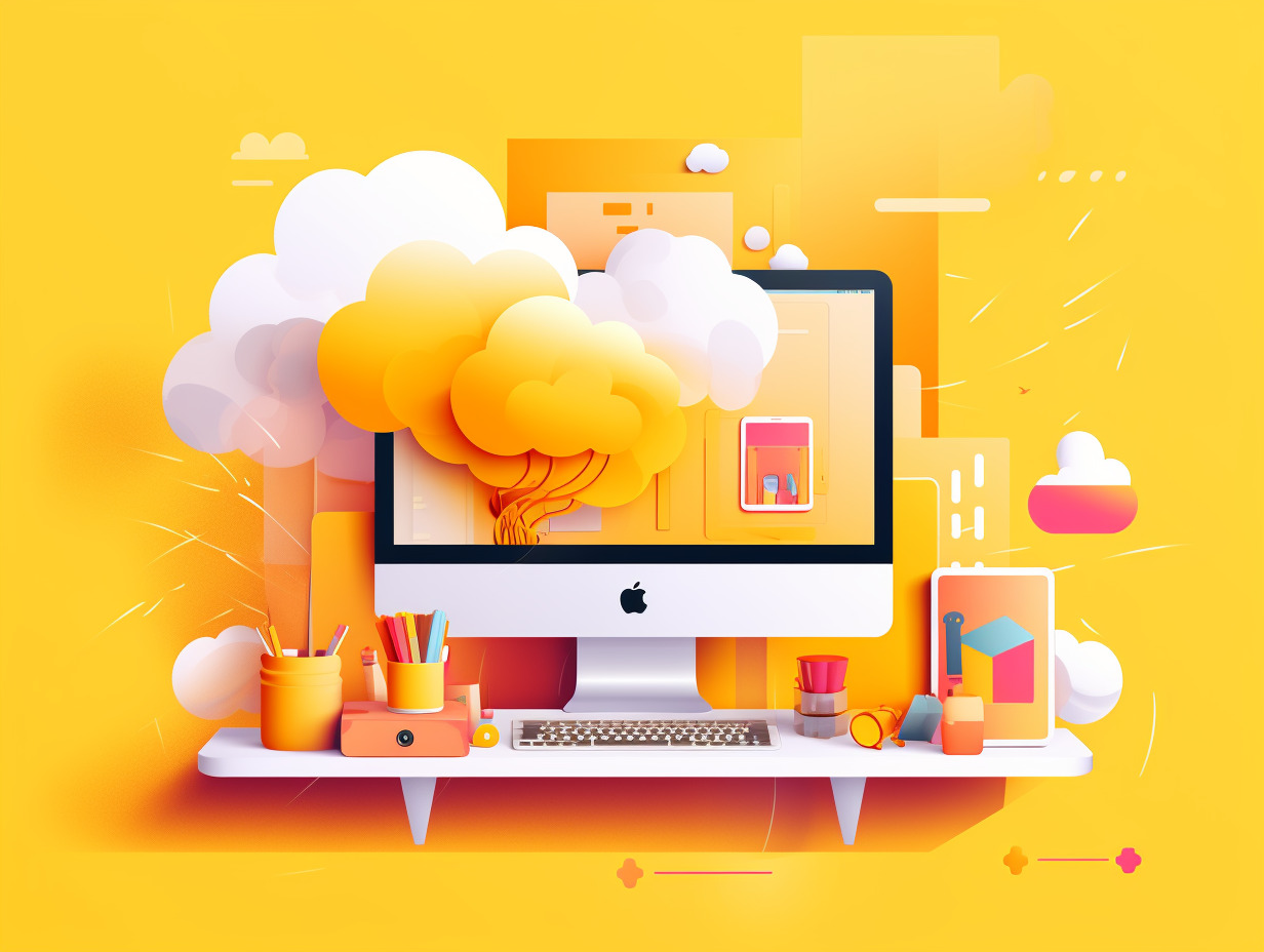
Web design trends also encompass innovative color schemes and gradients that captivate users’ attention. Beyond the traditional monochromatic or complementary color palettes, designers are now exploring vibrant and unconventional combinations. Bold and contrasting hues can evoke specific emotions and make a powerful impact on users.
Moreover, gradients have made a significant comeback, adding depth and visual interest to web designs. From subtle transitions to bold and dramatic color shifts, gradients create a sense of depth and dimension, enhancing the overall aesthetics. When used thoughtfully, gradients can draw users’ attention to specific elements, create a sense of movement, and contribute to a memorable and engaging user experience.
Minimalism and Simplified Layouts
In the realm of web design, less is often more. The minimalist approach has gained significant traction as a prevailing trend. Embracing clean and minimalist design aesthetics involves stripping away unnecessary clutter and focusing on essential elements that deliver a clear and concise message.
Minimalist designs feature clean lines, ample white space, and a limited color palette. By removing distractions, designers can create a sense of elegance, sophistication, and visual harmony. Minimalism also aligns with the principles of usability, allowing users to navigate and digest information effortlessly.
Streamlined layouts go hand in hand with minimalism, emphasizing simplicity and intuitive user experiences. Instead of overwhelming users with a multitude of elements and complex structures, web designers are opting for streamlined layouts that prioritize clarity and ease of use.
Ample white space, also known as negative space, plays a vital role in minimalist and streamlined designs. It allows content and key elements to breathe, reducing visual noise and enhancing readability. White space acts as a visual separator, guiding users’ attention to the most important parts of the interface. It provides a sense of balance and elegance, contributing to a delightful user experience.
By embracing minimalism and simplified layouts, web designers can create visually striking designs that communicate effectively and provide an intuitive browsing experience. In the dynamic landscape of web design trends, minimalist aesthetics and streamlined layouts continue to resonate with users seeking clarity and simplicity in their online interactions.
Microinteractions and Animated Elements
Microinteractions are small, subtle animations or interactive elements that add a touch of delight and interactivity to a website. They are designed to provide feedback, guide users, and create a sense of responsiveness. From a button changing color upon hover to a notification popping up after submitting a form, microinteractions contribute to a more engaging and intuitive user experience.
By strategically implementing microinteractions, web designers can bring websites to life and make them feel dynamic. These small details can leave a lasting impression on users, fostering a sense of enjoyment and satisfaction throughout their journey on the website.
Animations and transitions have become powerful tools in web design, offering opportunities for creativity and storytelling. Creative use of animations can enhance the visual appeal, guide users’ attention, and communicate information effectively. From smooth scrolling effects to immersive parallax scrolling, animations can create a sense of depth and engagement.
Transitions, on the other hand, enable smooth and seamless movements between different states or pages of a website. They provide continuity and flow, preventing jarring experiences as users navigate through the interface. Transitions can be used to reveal content, switch between sections, or add visual interest to user interactions.
When employed thoughtfully, microinteractions, animations, and transitions can transform a website into an interactive and captivating experience. They inject personality, enhance user engagement, and contribute to the overall success of a web design.
As we explore the web design trends of 2023, keep an eye out for the creative integration of microinteractions and animated elements. By incorporating these elements into your designs, you can create memorable experiences that delight and engage users, making your website stand out in the vast online landscape.
Mobile-First and Responsive Design
In today’s digital landscape, the prevalence of mobile devices makes it crucial for web designers to prioritize mobile-friendly design. With a significant portion of internet traffic originating from smartphones and tablets, neglecting mobile optimization can lead to poor user experiences and missed opportunities.
Mobile-first design is an approach that involves designing for mobile devices first before scaling up to larger screens. By starting with the smallest screen size, designers can ensure that the website is optimized for mobile users, providing a seamless and intuitive browsing experience. Mobile-friendly design focuses on responsive layouts, legible typography, and touch-friendly interactions, adapting to different screen sizes and orientations.
Responsive design is a key component of mobile-first design. It involves creating websites that dynamically adjust and adapt to different screen sizes and devices. Responsive design techniques allow the website to respond to the user’s behavior and environment, providing an optimal viewing experience across a range of devices.
Designers utilize various frameworks and tools to facilitate responsive design, such as CSS media queries and responsive grid systems. These tools enable designers to craft flexible and fluid layouts that automatically adjust based on the user’s screen dimensions.
Responsive design not only improves usability but also plays a crucial role in search engine optimization (SEO). Search engines prioritize mobile-friendly websites, as they enhance user experience and accessibility. Therefore, incorporating responsive design techniques is essential for reaching a wider audience and improving the overall performance of a website.
In the realm of web design trends, mobile-first and responsive design continue to be at the forefront. By prioritizing mobile-friendly design and employing responsive techniques, designers can ensure their websites are accessible, user-friendly, and future-proof, catering to the diverse needs of users in the ever-evolving digital landscape.
Conclusion
The constantly evolving nature of web design necessitates staying up-to-date with the latest trends. By keeping a finger on the pulse of the industry, designers can create modern and relevant websites that captivate and engage users. From dark mode and color schemes to minimalism and simplified layouts, each trend offers unique opportunities to elevate the user experience.
Adapting to these trends is crucial for web designers. It allows them to demonstrate their versatility and ability to stay ahead of the curve. By embracing new design approaches, they can showcase their creativity and attract clients who value innovation.
However, it’s important to remember that trends are not a one-size-fits-all solution. While they provide inspiration and guidance, it’s essential to tailor them to suit the specific needs and goals of each project. Finding the right balance between incorporating trends and maintaining a distinct brand identity is key to successful web design.
Are you already using a Client Portal? SuperOkay gives you 1 client portal free forever to start creating professional-looking Client Portals, custom branded to your clients’ brands – Start today by clicking here!
—
Enjoyed the article? Here’s a few others you might like:
How to Become a Freelance Web Designer
In today’s digital era, the demand for skilled web designers is skyrocketing. Companies and individuals alike are in constant need of professionals who can creat…
How to Find Web Design Clients in 2023
In the vast realm of the internet, learning how to find web design clients is crucial to your success. These clients are the lifeblood of your business, the ones who w…
How to Start a Digital Marketing Agency in 2023
Digital marketing has become increasingly vital in 2023, revolutionizing the way businesses connect with their target audience. As technology continues to evolve, lear…
How to work from home with no experience
In recent years, the concept of working from home has gained significant traction, becoming a preferred choice for many professionals. The shift towards remote work ha…